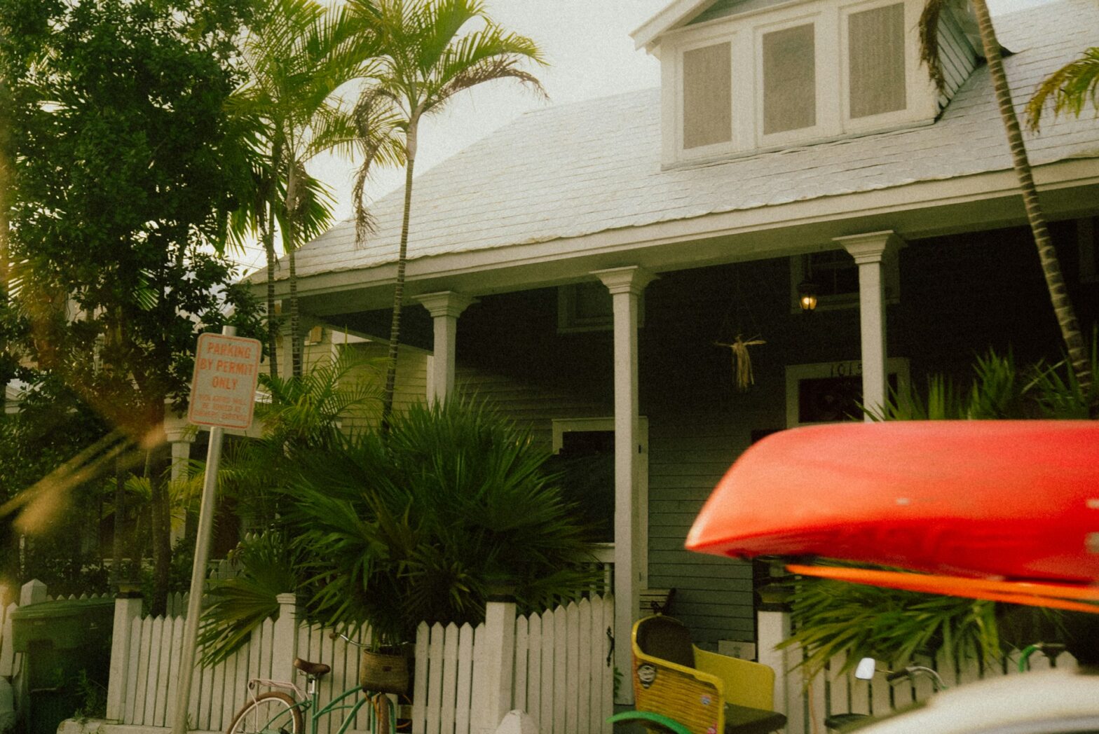


Vinyl fencing can look crisp and premium, but it can also read like a rushed add-on. The difference is rarely the material. It is the design choices, the layout, and the finish that people notice from the street. Since vinyl is uniform, small mistakes stand out fast. Here are five vinyl fence design mistakes that make properties look cheap, and how to avoid them.
Choosing a universal panel
The fastest way to drain curb appeal is choosing the tallest, flattest privacy panel, then installing it everywhere. In a smaller home, it can feel bulky and defensive. On a classic facade, it can look out of place.
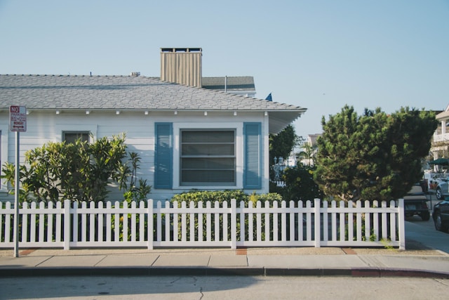
Start by looking at the home’s architecture, then choose a fence profile that fits: a simple picket for classic styles, or a clean flat top for modern lines. This fence company Naperville, can help you choose heights that suit each area.
Picking the wrong color
Bright white can look sharp on some homes. On others, it reads like plastic because it contrasts too hard with brick, stone, or warmer siding. Beige can be worse if it does not match anything else in the property.
Be sure to pick a tone that repeats an existing element, like window frames, soffits, or garage doors. Check samples outside at noon and at dusk. If you want white, soften the look with black hardware, so it feels intentional.
Skipping layout rhythm, especially around corners and gates
Cheap-looking fences often have awkward spacing. Posts land in odd places, gate widths feel squeezed, and corners look like afterthoughts. Before installation, plan a rhythm: post spacing that repeats, gate locations that make sense, and clean transitions at slopes. On grades, avoid stair-step panels unless the architecture supports it. A racked panel, or a stepped design with consistent reveal, usually looks more premium.
Letting the top line wave and the corners drift
A vinyl fence can be brand new and still look low budget if the lines do not run clean. The eye catches a crooked top rail faster than it notices the material. This usually happens on sloped yards where installers force panels to follow the ground without a plan.
On hills, step the sections in even drops, or use racked panels built to handle grade changes. Set every post plumb, string the line, and check alignment before concrete sets. Additionally, treat corners like a finish detail, not a shortcut. When corners drift, the whole run looks off, even if the panels are fine.
Treating the fence as a blank wall
Long, uninterrupted runs can make a vinyl fence feel like a budget barrier. Break up the mass with rhythm. Use post caps that add depth, consider a lattice top in select sections, or transition from full privacy to semi-privacy near patios.
Be sure to also tie the fence into the landscape. Add beds, edging, and lighting so it feels part of the outdoor plan, not an afterthought. Even simple planting at corners softens the look and boosts curb appeal.
Endnote
A vinyl fence should look like part of the property, not a quick cover-up. Match the profile to the home, pick a tone that works with your exterior, and keep details simple. When the design feels planned, vinyl reads crisp, durable, and upscale.