


From the recent Butter Yellow trend, to longstanding favourites like Mushroom or Sage Green, food is becoming increasingly associated with interior design and colour theory.
Pantone’s colour of the year for 2025, Mocha Mousse, is another example of colour palettes taking inspiration from the kitchen. But why have ‘Edible Interiors’ gained so much popularity recently?
Mike Whitfield, luxury interiors expert at LUSSO believes that in many ways, colour and taste go hand in hand. He explains: “Colour has the power to shape people’s perception of taste, and we expect certain flavours to match particular colours and evoke specific emotions.
“Colours such as Butter Yellow evoke specific emotions and memories linked to the foods they resemble. This connection makes these colours more relatable and enjoyable, creating a sensory impact. Associating food with colour highlights the integration of daily life and aesthetics, evoking comfort and familiarity, whilst also providing a recognisable touchpoint that helps people envisage a colour purely due to its association with something they are familiar with.”
To explain the secrets behind Edible Interiors, Mike has partnered with Amy Stoddart, Creative Director Amy Stoddart Studio, to reveal more about the trend. As an interior designer, Amy creates timeless modern spaces with a focus on craftsmanship and practical luxury.
Amy says: “The key behind the popularity of these colours is that they’re comforting, nostalgic, and familiar, conjuring warmth, flavour, and texture in a way that flat colour codes never could. Butter Yellow feels softer and more inviting than just pale yellow, while Mocha Mousse suggests depth, richness and indulgence.
“They tend to sit within a warm, muted, and earthy palette – think soft pastels, grounding neutrals, and nature-inspired hues.”
In the home: Welcoming warmth and comforting familiarity
Whilst dependent on each individual colour, an Edible Interiors palette will often have certain similarities with what they bring to a room, including how they impact the overall aesthetic and alter the mood.
Mike explains: “Butter Yellow is a mood boosting colour, combining the happiness of yellow with a muted pastel tone. This makes it ideal for bathrooms, as it contributes to the overall mood and wellness. It makes a space inviting, as it’s associated with sunlight and fresh blooms, which aligns with the interior trend of connecting with nature and bringing the outdoors in.
“A neutral tone like Mocha Mousse adds a sense of comfort, sophistication and warmth to a space. The versatile tone adds a welcoming and homely feeling, making it the perfect choice for living spaces, bedrooms and bathrooms. Sage Green meanwhile brings serenity, calmness and a connection to nature to a room. The soothing colour adds a natural touch to spaces while creating subtle sophistication.”
Amy adds: “An Edible Interiors colour palette brings a sense of warmth and ease to space. These tones are inviting without being overwhelming and work beautifully to soften architectural edges or bring a cosier feel to open-plan spaces.”
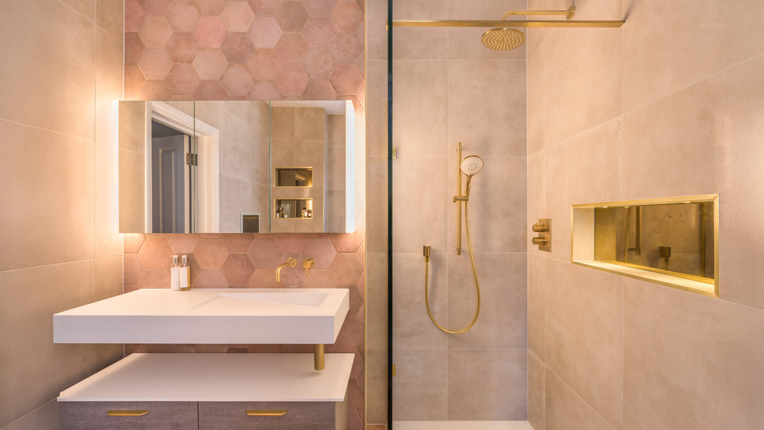
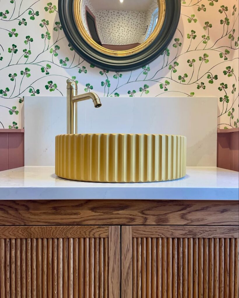
In the bathroom: Enhancing with mood boosting, calming tones
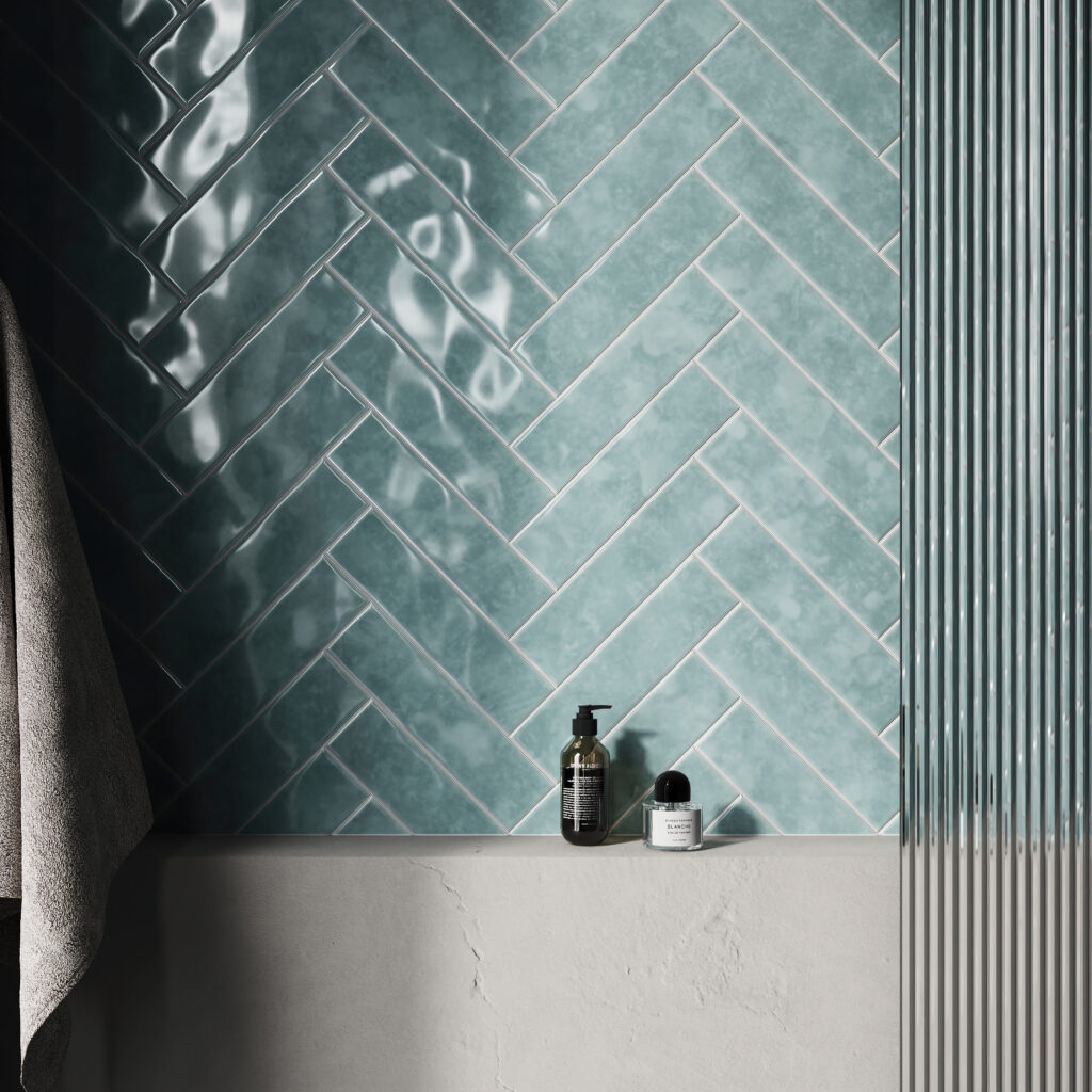
Mike shares: “Many colours in the Edible Interiors palette are perfect for a bathroom, whether as the dominant colour or as a statement feature, like a coloured freestanding bath. Sage Green tiles for example infuse bathrooms with a tranquil, nature-inspired ambience. Opt for kit kat or baton mosaic tiles on your bathroom walls for maximum impact.
“Meanwhile, a strong colour like Butter Yellow should be incorporated where it makes sense organically. If you want to create a colour statement in your bathroom, painting a vanity unit or incorporating a coloured concrete bath is the perfect way for a stand-alone feature to gain attention. This way it adds warmth and a burst of sunshine to your bathroom, making it the perfect place to relax and unwind in contentment.
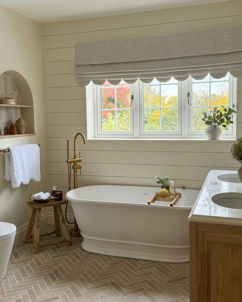
“Neutral tones like Mocha Mousse can be a dominant feature in the bathroom, especially through the use of natural stone and wood. This is also a great way to add texture and a rustic edge to your bathroom, by choosing textured or fluted tiles in a light Mocha Mousse shade. For a more subtle touch, incorporate towels and bath mats to create a spa-like ambience.”
Amy expands: “You can choose Zellige or handmade tiles in blush, biscuit or creamy tones, which work beautifully to add texture and tonal depth. You can pair these colours with a natural stone, such as honed marble, limestone, or travertine to elevate these tones with a natural elegance while maintaining the earthy character.”
In the kitchen: Statement styling or muted backdrop
Mike says: “In the kitchen, Butter Yellow is the perfect choice for a smaller space to make the room feel bright and airy. It can be incorporated through subtle accents such as tile backsplashes, or statement pieces such as the cupboards themselves. The soft yellow hue reflects light beautifully, while choosing a deeper shade can add richness. For metallics, such as the kitchen tap or handles, opt for a brushed gold, brass or chrome.
“Natural stone tiles, such as travertine, offer the perfect gateway to incorporate a tone like Mocha Mousse into the kitchen for a welcoming and homely ambience. Travertine or marble tiles are a luxurious and practical option for the flooring, whilst fluted tiles make for a statement backsplash.
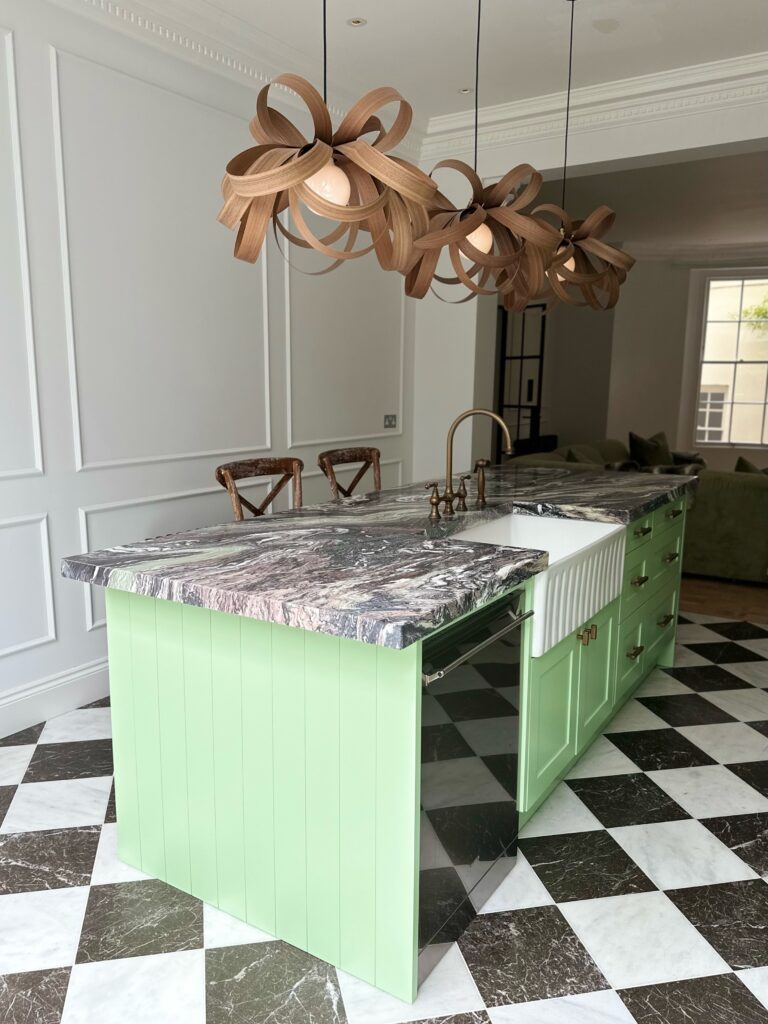
“For a farmhouse style kitchen, Sage Green adds an inviting appeal to a kitchen without overpowering it, especially when paired with a brass or gold kitchen tap. Style a kitchen with Sage Green cabinets, accessories, tiles and even hints of floral accents. Make sure to balance it out with different colour flooring and tiles, such as oak flooring or neutral mosaic tiles.”
Amy shares: “A Sage or Mushroom tone on shaker-style cabinets works well with natural stone and unlacquered brass for a classic, understated look. Alternatively, consider a Butter Yellow on the walls to bring warmth and lightness, especially in north-facing rooms.”
Timeless design or trend of the moment?
Mike says: “Although Butter Yellow is this year’s popular colour trend, there is a risk of it becoming outdated. To prevent this, consider how you use the shade in your home, including what you pair it with, how you apply it and how you layer it. I recommend opting for a muted or soft yellow over anything saturated, as these can perform as a neutral and are more versatile. If this shade is used alongside white and natural linen fabrics, it will feel forever modern.
“On the other hand, neutral tones like Mocha Mousse, are timeless due to their sophistication, warmth and neutrality. It sits between taupe, brown and soft grey, making it the perfect balance of warmth, but not too rich, yet neutral but not too cold. The timeless shade can also be incorporated across a range of interiors throughout the eras, such as Mid-century, traditional, and contemporary designs.
“Similarly, Sage Green can be a timeless shade, depending on how it’s used in the home. It can act as a neutral or a statement colour, and because it’s so versatile, it pairs with almost any material and metallic accent.”
Amy says: “These colours are rooted in nature and everyday familiarity, which gives them a degree of timelessness, but like all trends, the way they’re used can date.
“To keep them feeling current, opt for classic applications like painted cabinetry or natural materials, avoid overly stylised pairings, and focus on quality textures and finishes. Using them as a backdrop rather than a statement allows flexibility as tastes evolve.”
What next?
Whilst individual colours may fall in and out of fashion, the trend of naming colours after food is likely here to stay.
Mike predicts: “Food provides an instantly recognisable touchpoint that helps people to envision what a colour will look like, and for interior designers, paint manufacturers and trend setters, this offers a great way for them to communicate more clearly to consumers. We will likely see more trending colours with a recognisable edible name for the foreseeable future.
“Similarly, we may also see this expand to other easily recognisable references that we see in day to day life, taking inspiration from things such nature, materials or animals that are easily recognised and envisioned.”