


Unsure how you should best match your curtains to your living space? It can be difficult when there are so many options to choose from.
Amy Wilson, interior designer at 247 Curtains share’s her expertise on the best colour combinations to use in your home.
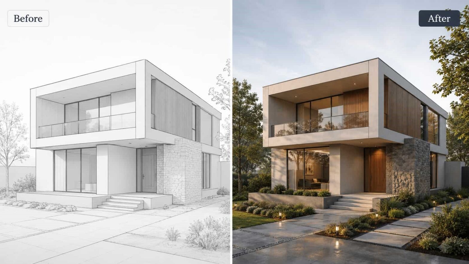
Choosing curtain colours is all about undertones, light and context. The same fabric can read cooler in a north-facing room, warmer next to oak floors, or too loud against patterned rugs. Before you order swatches, test ideas on a photo of your actual space. With PaintIt AI, you can preview how neutrals blend vs. contrast, see day-to-night shifts, compare sheers and blackout linings, and trial accents on trims or pelmets. Exploring multiple options in minutes helps you shortlist faster, reduce sampling waste, and brief your designer with confidence.
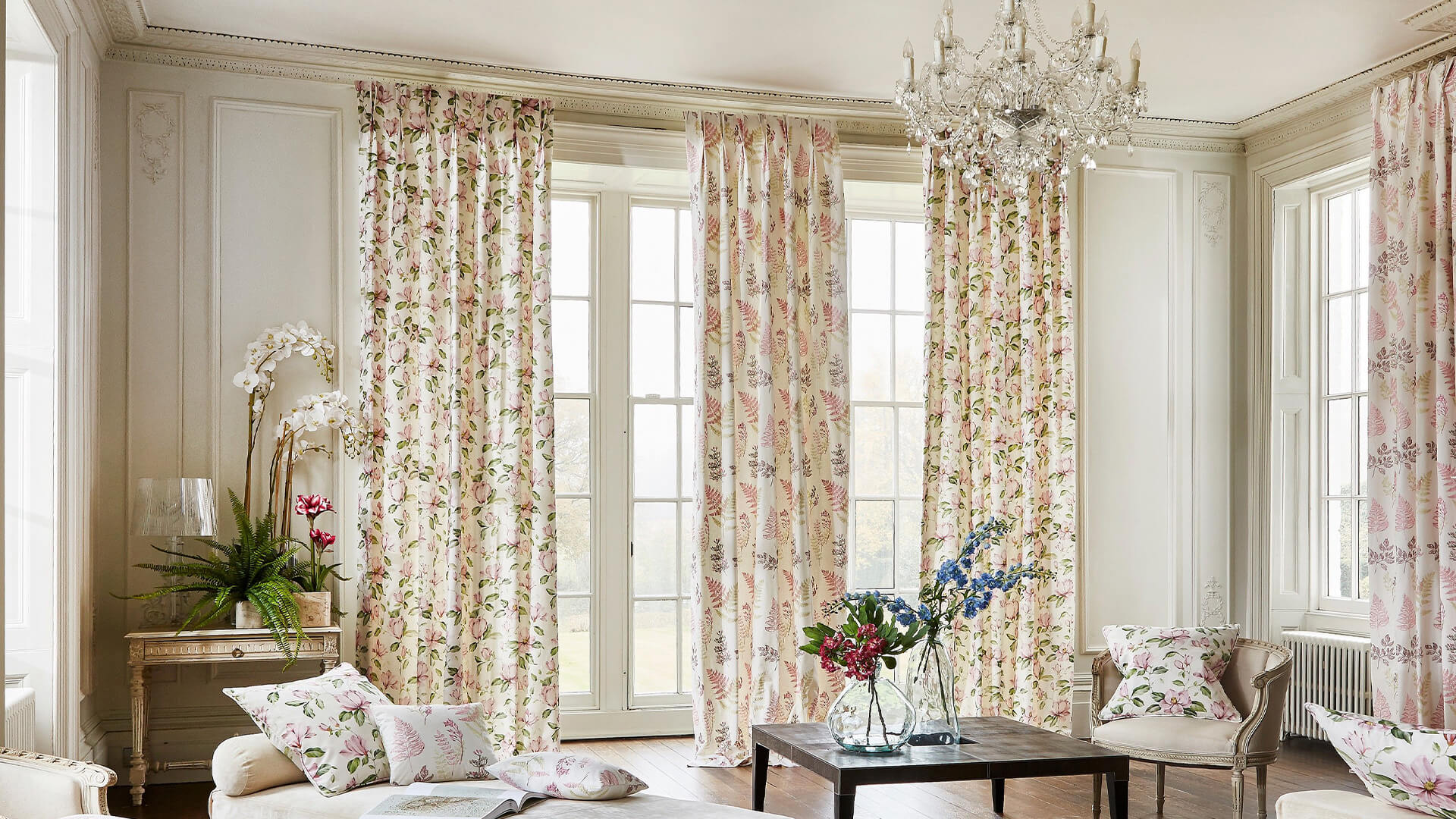
Use a neutral room as a blank canvas
The great thing with having a neutral colour scheme in your home is that you have a blank canvas to work with, meaning you have the option to go bold with the colour of your curtains.
Amy says: “With neutral, there aren’t really any colours that won’t go. Look at the furniture in the room to help you identify what colours you want to bring out, or any patterns you have used which you can translate onto the curtains.”
“Patterns are a great way to add personality and character to a neutral home. But if you are scared of going down a maximalist route and want to keep it clean, choose patterns that include muted colours such as baby pinks and florals.”
Make use of the colour wheel
Etsy’s recent marketplace report highlighted two colours for their colour of the year, indio blue and honeycomb orange. Amy explains why that colouring pairing is such the perfect match.
“Looking at the colour wheel helps you understand what colours are cohesive with each other and that’s why I always recommend that it features a lot of dark blue with burnt orange curtains” she explains.
“These two colours next to each other make them pop and look vibrant. Using this technique of looking at the colour wheel means that you will be able to achieve effortless cohesion that always looks stylish.”
Pair greens with happy yellow tones
Green shades, in particular sage, has become the new beige in interior design and can be found in many modern day homes.
Amy suggests: “For a mood boosting take on green interiors, try introducing joyful tones through yellow curtains to give your home a hit of dopamine. Using both these colours in tandem creates a happy home which replicates the brighter seasons of spring and summer all year round.”
“Yellow doesn’t have to be in your face, there are so many tones to choose from to create a peaceful space that’s both bright and light. For example, if your home is covered trendy sage, try pairing it with sorbet lemons shades ”
Get playful with pink
With the new Barbie film coming out in July, barbiecore is in – think feminine and pink! If you have your own barbie dream house, here is the colour combination you need to try.
Amy says: “If you’re a lover of pink and this reflects in your home, I suggest adding red curtains to your window dressing to tie it all together. Often associated with Valentine’s day, red and pink done right is fun, flirty, and full of personality.”
Do grey the right way
While many are moving away from grey in their home, there is a way to use it in your home in a sophisticated and luxurious way.
“Steel, slate, and charcoal are all good shades for a more contemporary take on grey and combining the lot aids in creating a more mature and masculine look. Textured slate grey curtains or black curtains paired with warm-toned lighting is really effective in a room like this to create atmosphere and ambience” Amy explains.
Layer existing colours
If you want to go for a minimalist look that is still interesting to the eye, try carrying one colour throughout your home.
Amy insists: “Don’t be afraid to match the colour of your curtains to the wall to achieve a sleek, streamlined look. Tone-on-tone and colour drenching is very big at the moment, and works really great in smaller homes as it gives the illusion of your space looking bigger.”
“However, I would always suggest going a shade lighter or darker with your curtains, to help create dimension and avoid your room looking flat. Blue’s look especially nice layered on top of eachother and creates a really calming effect.”
Try before you buy
“Before making your final decision on what curtain colour you choose, consider ordering free samples. This is the perfect opportunity to try before you buy, which will save you the stress of investing your money in something that you don’t love.
“Ordering your samples in the colours you gravitate towards will help you choose between a few when you see them in person. Not only this, but it will also help you determine which texture works to frame your window. Once you’ve found your perfect match from the samples, you can confidently order curtains and blinds that will transform your space into a true reflection of your personal style. .”